CSS Star Ratings With Radio Buttons
CSS Imageless Star Rating Readonly
CSS Star Rating System With SVG
CSS & Radio Button Star Rating
Apple Appstore Styled Star Rating In Pure Html/css
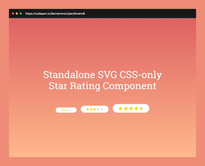
Standalone SVG CSS-only Star Rating Component
Five Star Rating Field With Animated Hover Effect


下面介紹常見的CSS簡寫規則:
一、盒子大小
這里主要用于兩個屬性:margin和padding,我們以margin為例,padding與之相同。盒子有上下左右四個方向,每個方向都有個外邊距:
margin-top:1px;
margin-right:2px;
margin-bottom:3px;
margin-left:4px;
你可以簡寫成:
margin:1px 2px 3px 4px;
語法 margin:top right bottom left;
//四個方向的邊距相同,等同于margin:1px 1px 1px 1px;
margin:1px;
//上下邊距都為1px,左右邊距均為2px,等同于margin:1px 2px 1px 2px;
margin:1px 2px;
//右邊距和左邊距相同,等同于margin:1px 2px 3px 2px;
margin:1px 2px 3px;
//注意,這里雖然上下邊距都為1px,但是這里不能縮寫。
margin:1px 2px 1px 3px;
二、邊框(border)
邊框的屬性如下:
border-width:1px;
border-style:solid;
border-color:#000;
可以縮寫為一句:
border:1px solid #000;
語法 border:width style color;
三、背景(Backgrounds)
背景的屬性如下:
background-color:#f00;
background-image:url(background.gif);
background-repeat:no-repeat;
background-attachment:fixed;
background-position:00;
可以縮寫為一句:
background:#f00 url(background.gif) no-repeat fixed 0 0;
語法是background:color image repeat attachment position;
你可以省略其中一個或多個屬性值,如果省略,該屬性值將用瀏覽器默認值,默認值為:
-
color: transparent
-
image: none
-
repeat: repeat
-
attachment: scroll
-
position: 0% 0%
四、字體(fonts)
字體的屬性如下:
font-style:italic;
font-variant:small-caps;
font-weight:bold;font-size:1em;
line-height:140%;
font-family:"Lucida Grande",sans-serif;
可以縮寫為一句:
font:italic small-caps bold 1em/140%"Lucida Grande",sans-serif;
注意,如果你縮寫字體定義,至少要定義font-size和font-family兩個值。
五、列表(lists)
取消默認的圓點和序號可以這樣寫list-style:none;,
list的屬性如下:
list-style-type:square;
list-style-position:inside;
list-style-image:url(image.gif);
可以縮寫為一句:
list-style:square inside url(image.gif);
六、顏色(Color)
16進制的色彩值,如果每兩位的值相同,可以縮寫一半。例如:
Aqua: #00ffff ——#0ff
Black: #000000 ——#000
Blue: #0000ff ——#00f
Dark Grey: #666666 ——#666
Fuchsia:#ff00ff ——#f0f
Light Grey: #cccccc ——#ccc
Lime: #00ff00 ——#0f0
Orange: #ff6600 ——#f60
Red: #ff0000 ——#f00
White: #ffffff ——#fff
Yellow: #ffff00 ——#ff0
七、屬性值為0
書寫原則是如果CSS屬性值為0,那么你不必為其添加單位(如:px/em),你可能會這樣寫:
padding:10px 5px 0px 0px;
試試這樣吧:
padding:10px 5px 00 ;
八、最后一個分號
最后一個屬性值后面分號可以不寫,如:
#nav{
border-top:4px solid #333;
font-style: normal;
font-variant:normal;
font-weight: normal;
}
可以簡寫成:
#nav{
border-top:4px solid #333;
font-style: normal;
font-variant:normal;
font-weight: normal
}
九、字體粗細(font-weight)
你可能會這樣寫:
h1{
font-weight:bold;
}
p{
font-weight:normal;
}
可以簡寫成:
h1{
font-weight:700;
}
p{
font-weight:400;
}
十、圓角半徑(border-radius)
border-radius是css3中新加入的屬性,用來實現圓角邊框。
-moz-border-radius-bottomleft:6px;
-moz-border-radius-topleft:6px;
-moz-border-radius-topright:6px;
-webkit-border-bottom-left-radius:6px;
-webkit-border-top-left-radius:6px;
-webkit-border-top-right-radius:6px;
border-bottom-left-radius:6px;
border-top-left-radius:6px;
border-top-right-radius:6px;
可以簡寫成:
-moz-border-radius:0 6px 6px;
-webkit-border-radius:0 6px 6px;
border-radius:0 6px 6px;
語法 border-radius:topleft topright bottomright bottomleft
]]>說明:
絕對定位div
position:absolute;
頂部和左邊距
top:50%; left:50%;
使用外補丁 margin 負值,負值大小為層自身高度寬度各除以二
margin:-200px 0 0 -275px;
測試環境:
IE6
Mozilla 2.0.0.5
Opera 9.22
Netscape 9.0b1
Safari for Windows 3.0.2
附:使用此方法有個 bug,當瀏覽器窗口小于 div 時,頂部和左部內容會有所隱藏。 ]]>
CSS 兼容要點:
DOCTYPE 影響 CSS 處理
FF: P 設置 margin-left, margin-right 為 auto 時已經居中, IE 不行
FF: body 設置 text-align 時, P 需要設置 margin: auto(主要是 margin-left,margin-right) 方可居中
FF: 設置 padding 后, P 會增加 height 和 width, 但 IE 不會, 故需要用 !important 多設一個 height 和 width
FF: 支持 !important, IE 則忽略, 可用 !important 為 FF 特別設置樣式
P 的垂直居中問題: vertical-align:middle; 將行距增加到和整個P一樣高 line-height:200px; 然后插入文字,就垂直居中了。缺點是要控制內容不要換行
cursor: pointer 可以同時在 IE FF 中顯示游標手指狀, hand 僅 IE 可以
FF: 鏈接加邊框和背景色,需設置 display: block, 同時設置 float: left 保證不換行。參照 menubar, 給 a 和 menubar 設置高度是為了避免底邊顯示錯位, 若不設 height, 可以在 menubar 中插入一個空格XHTML+CSS兼容性解決方案小集
使用XHTML+CSS構架好處不少,但也確實存在一些問題,不論是因為使用不熟練還是思路不清晰,我就先把一些我遇到的問題寫在下面,省的大家四處找^^
1.在mozilla firefox和IE中的BOX模型解釋不一致導致相差2px解決方法:
P{margin:30px!important;margin:28px;}
注意這兩個margin的順序一定不能寫反,據阿捷的說法!important這個屬性IE不能識別,但別的瀏覽器可以識別。所以在IE下其實解釋成這樣:
P{maring:30px;margin:28px}
重復定義的話按照最后一個來執行,所以不可以只寫margin:XXpx!important;
2.IE5 和IE6的BOX解釋不一致IE5下P{width:300px;margin:0 10px 0 10px;}P的寬度會被解釋為300px-10px(右填充)-10px(左填充)最終P的寬度為280px,而在IE6和其他瀏覽器上寬度則 是以300px+10px(右填充)+10px(左填充)=320px來計算的。這時我們可以做如下修改
P{width:300px!important;width /**/:340px;margin:0 10px 0 10px}
,關于這個/**/是什么我也不太明白,只知道IE5和firefox都支持但IE6不支持,如果有人理解的話,請告訴我一聲,謝了!:)
3.ul標簽在Mozilla中默認是有padding值的,而在IE中只有margin有值所以先定義
ul{margin:0;padding:0;}
就能解決大部分問題
4.關于腳本,在xhtml1.1中不支持language屬性,只需要把代碼改為
<script type=”text/javascript”>
就可以了
]]>
2006年即將結束,各大機構紛紛開始總結2006的各領域代表事件。看看smashingmagazine.com公布2006世界上基于CSS最美的50個網站, 這里僅僅是基于CSS上的視覺美麗,并不認同個別網站的交互布局設計.
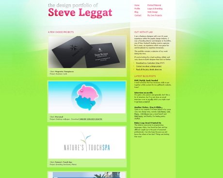
SteveLeggat.com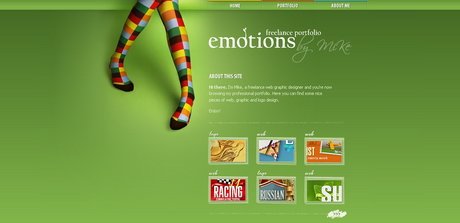
Emotionslive.co.uk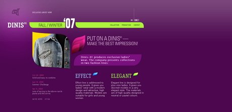
Dinis91.com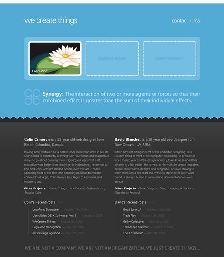
WeCreateThings.com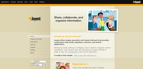
Joyent.com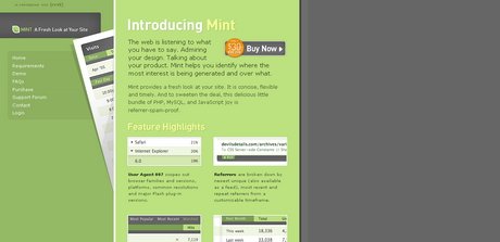
Haveamint.com
Vivabit.com
olivier.danchin.neuf.fr
Foxie.ru
#p#副標題#e#

Cameronmoll.com/portfolio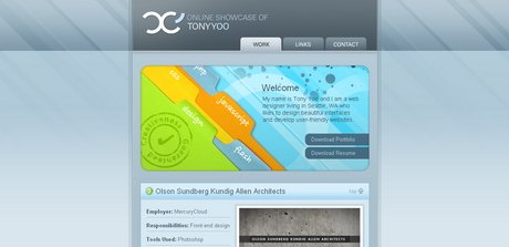
Tonyyoo.com/v2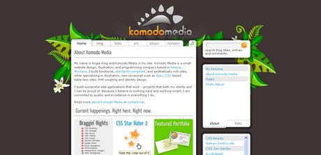
Komodomedia.com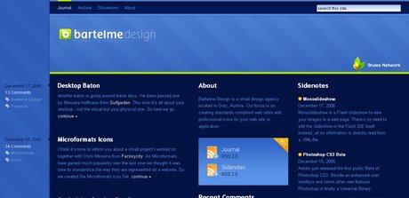
Bartelme.at
Quatuour.be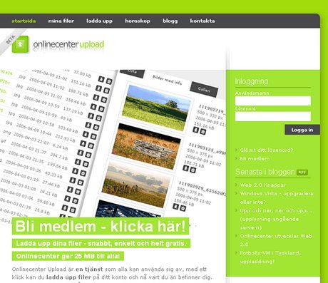
Onlinecenter.nu
Fall.tnvacation.com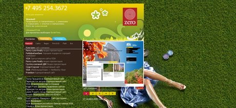
Zero.ru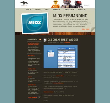
Methodarts.com
#p#副標題#e#

Summer.tnvacation.com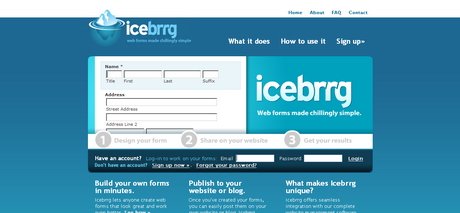
Icebrrg.com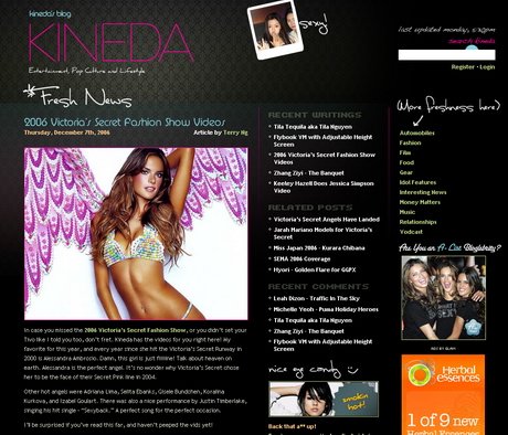
Kineda.com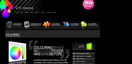
Colourmod.com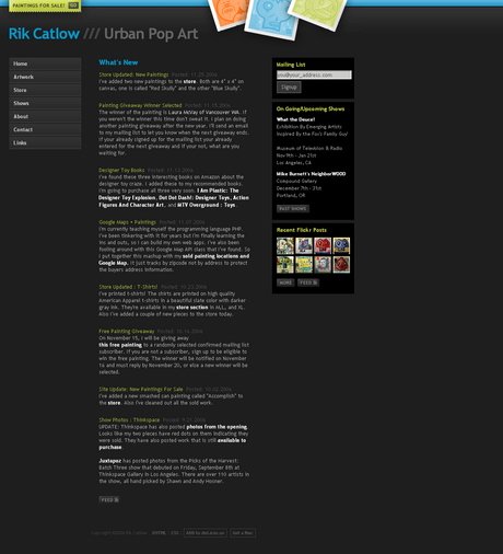
Rikcat.com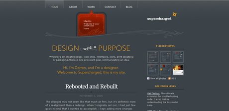
BeSuperCharged.com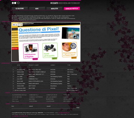
M122arts.com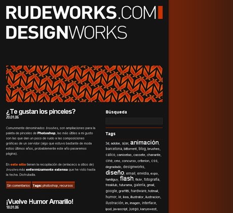
Rudeworks.com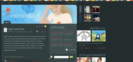
Veerle.duoh.com
#p#副標題#e#

Obuweb.com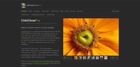
Slideshowpro.net
Whitwa.net
Mstefan.com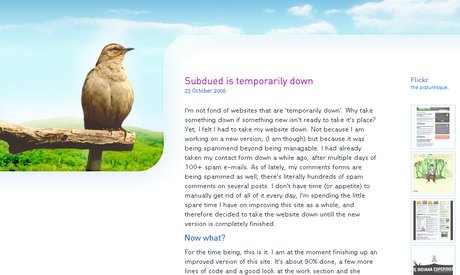
Subdued.net
Devlounge.net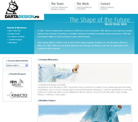
Dartadesign.ro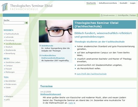
Theologisches-seminar-elstal.de
#p#副標題#e#

Nice-Design.co.uk
Media2006
ElectricPulp.com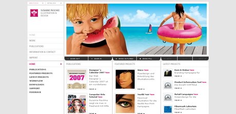
SusannePaschke.de
PixelEden.net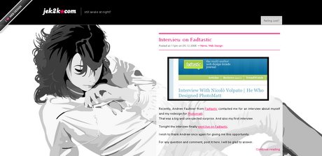
Jek2k.com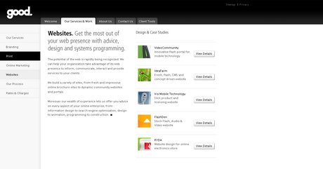
Thegoodness.com.au
Morellc.com
#p#副標題#e#
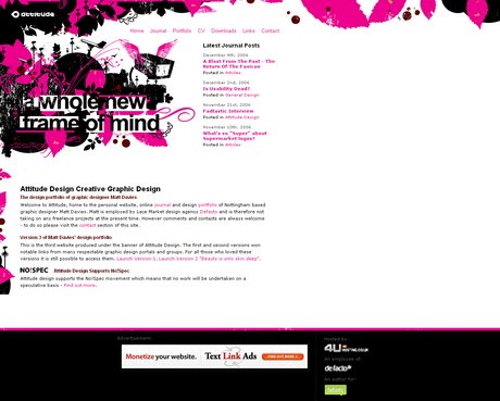
Attitudedesign.co.uk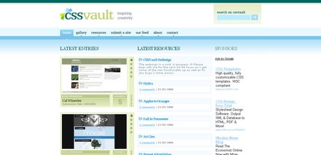
CSS Vault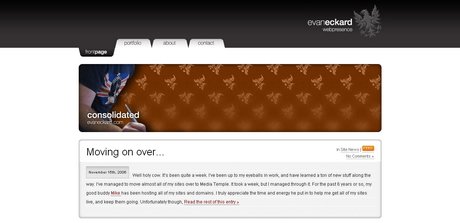
Evaneckard.com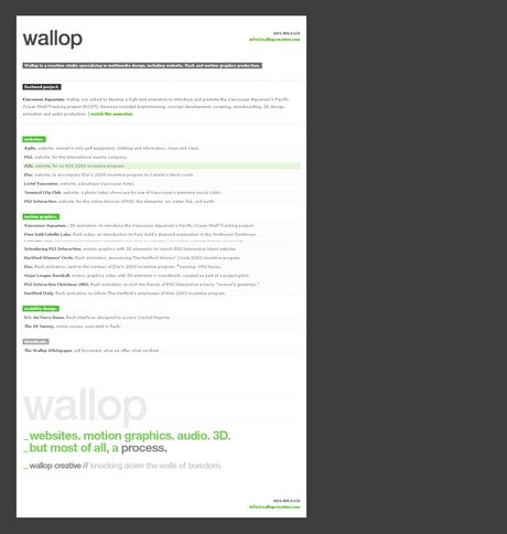
WallopCreative.com
Jeffcroft.com
]]>
經常有朋友問:如何使有超級連接的文字不出現下劃線,如何使鼠標移動到超連上產生變色的效果?其實這些通過傳統的方法是辦不到的。而使用CSS的控制卻可以非常輕松地作到,而且,頁面的代碼也不會臃腫。
★★先看看超連沒有下劃線的例子:
例子1: 這個連接可以去頁面底部,但是沒有下劃線。
是如何作到這一點的呢?在<head>和</head>之間加上如下的CSS語法控制:
<style type=”text/css”>
<!–
a:link { text-decoration: none}
a:active { text-decoration: none }
a:visited { text-decoration: none }
–>
</style>
這樣瀏覽器在執行時,就明白:
a:link 指正常的未被訪問過的鏈接
a:active 指正在點擊的鏈接
a:visited 指已經訪問過的鏈接
其中,text-decoration是文字修飾效果的意思,none參數表示使有超級鏈接的文字不顯示下劃線。如果講none替換成underline就表示有下劃線,換成overline則給超連文字加上劃線,換成 line-through給超連文字加上刪除線,blink則使文字在閃爍。
★★類似的控制:使粗體文字加上刪除線。
例子2: 閃爍的粗體文字 使用的代碼是:B { text-decoration: line-through }
★★類似的控制:是粗體文字中所有的字母大寫。
使用代碼: B { text-transform: uppercase }
例子3:產生既大寫,又有顏色,又有刪除線的效果 hello welcome and enjoy them !
以上的代碼是:b { text-decoration: line-through; text-transform: uppercase; color: #66FFFF}
類似的,用lowercase使所有字母小寫顯示,capitalize 使每個單詞的首字母大寫顯示。
★★下面則是產生連接變色效果的內容:
在上面的“例子1”中,如果作一點修飾,可以使具有link,active,visited屬性的連接顯示不同的顏色,但是卻不會產生鼠標覆蓋變色效果。先看下面的代碼,使連接文字顯示綠色,正在點擊的連接顯示黃色,已經反復問過的連接顯示紅色。算是復習前面的內容(別忘記啊!):
<style type=”text/css”>
<!–
a:link { text-decoration: none ; color: green }
a:active { text-decoration: none ; color: yellow }
a:visited { text-decoration: none ; color: red }
–>
</style>
如果要產生變色效果,就要用到另一個屬性了,這就是 hover,看下面的代碼。
a:hover { text-decoration: none ; color: yellow } 表示鼠標移動到連接文字上時,文字修飾風格為“無”(即沒有下劃線),同時顯示黃色。
a:hover { text-decoration: underline; color: green } 表示鼠標移動到連接文字上時,文字修飾風格為“underline”(即下劃線),同時顯示綠色。
★★擴展一下:如果我們同時用下面2種屬性,會產生什么效果呢?
a:link { text-decoration: none ; color: yelloe ; font-size: 9pt }
a:hover { text-decoration: underline; color: green ; font-size: 12pt }
連接文字沒有下劃線,黃色顯示,9pt大小。鼠標移動到連接上時出現下劃線,顏色為綠色,字符大小12pt。是不是變色了?而且字體由于大小變化,就有動感了,似乎一下子擴大了。
總之,所有前面講過的方法,要綜合運用才可以呀。
★★注意:并不是所有的瀏覽器都支持所有的選項屬性。自己在多個瀏覽器上測試一下。
]]>
文字屬性 標識符 作用 屬性值
font-family: 定義文字類型,順序尋找,先找到的為選定值,若都找不到則用默認值 宋體,黑體等
font-style: 定義字體風格。 normal(標準)italic(斜體)oblique(傾斜)
font-variant: 改變英文字母的顯示 normal,small-caps(小型大寫字母)
font-weight: 使字體加粗 normal(相當于400),bold,lighter,bolder或100~900的九個數
font-size: 定義字體大小 任意數字,以pt(點陣)、px(屏幕象素)為單位
文本屬性 text-decoration: 修飾文字 underline(加下劃線)overline(加上劃線)line-thought(加刪除線)none(清除下劃線,缺省)
text-align: 文本的顯示位置及方式 left,right,center,justify(從左到右對齊)
顏色屬性 color: 定義字體顏色 1.以英文單詞為關鍵字
2.以十六進制3.用RGB值,用法:RGB(255,0,0) 0~255
背景屬性
background-color: 定義背景顏色 同于”顏色屬性”的用法
background-image: 定義背景圖象 用法:body{background-image:url(bg.gif)}
其中”bg.jif”為任意圖片
background-repeat: 按不同方式復制背景 repeat-x:按水平方向復制
repeat-y:按垂直方式復制
background-attachment 背景的固定 scroll:背景內容隨前景一起滾動
fixed:背景不動
background-position: 定義背景位置 top:背景與前景內容頂部對齊
bottom,left,right
方式:xxpt xxpt或x% x%或left top
(以兩個英文單詞為組合,注意:中間有空格!!)
邊界屬性 margin-top: 對象上邊界 缺省值為:0
關鍵字:auto
數值:pt,px,in(英寸),cm(厘米)為單位
margin-right: 對象右邊界 同上.
margin-bottom: 對象下邊界 同上.
margin-left: 對象左邊界 同上.
邊界的簡潔設置 形式 注解
DIV{margin:10cm} 所有邊界為10cm
DIV{margin:10cm 3cm} 上下為10cm,左右為3cm
DIV{margin:1cm 3cm 5cm 7cm} 上為1cm,右為3cm,下為5cm,左為7cm。

